I love this – What Star Wars The Force Awakens would look like if Wes Anderson was directing.
:)
I love this – What Star Wars The Force Awakens would look like if Wes Anderson was directing.
:)
Google has re-introduced re-captcha, an alternative to the 2000 user dialogue challenge-response test used in computing and on the Web to determine whether or not the user is human.
http://www.google.com/recaptcha/intro
Instead of asking customers/users to re-enter 2 distorted words, which has been known to have accessibility issues, the new system uses IP address detection and cookies to reduce the user input to a simple checkbox.
Brilliant!
Update (3 Dec 2014): Wired has written a lengthy article on the new Google 1 click reCaptcha
Macmillan Science & Education will allow the public to access its treasure chest of rich scientific research was announced today. Articles on nature.com will be made widely available to read and share to support collaborative research.
Macmillan Science and Education, one of the leading publishing and technology companies in the world, today announces the launch of a groundbreaking publishing initiative that will make it easy for readers to share an unprecedented wealth of scientific knowledge instantly with researchers and scientists across the globe.Subscribers to 49 journals on nature.com can now legitimately and conveniently share the full-text of articles of interest with colleagues who do not have a subscription via a shareable web link on nature.com. In addition, Macmillan Science and Education will take a lead on opening up public engagement with scientific knowledge to society at large by giving access to the same content to readers of 100 global media outlets and blogs.MacMillan Science and Education
Image Source: Nature Journal April 2014
Last week, a group of us attended the IxDA London talk by Durrell Bishop, one of the most respected Designers in London. His enlightening talk explored a different approach to the design of products, software & services and more importantly made us think differently through a collaborative exercise later in the evening. Great night!

Durrell has been featured in Bill Moggridge’s classic Designing Interactions book, and is most famous for the landmark marble answering machine, as well as his contributions to Berg’s Little Printer and Cloudwash.
The night also included a talk by Dan Lockton on Energy Use.
#Sketchnotes for @danlockton‘s work on energy use and understanding pic.twitter.com/pPJfjMWRac
— IxDA London Local (@IxDALondon) November 26, 2014
Below are some photos and quotes from the London event.


As designers, too often we base our designs on our experience of how existing similar things work. We are too influenced by the low-hanging fruit of associations, brand and desire. Too many interfaces are based on the layout tools…Durrell Bishop
I stumbled across this short film by Erik Wernquist this weekend. It was a film featured in Vimeo’s Staff Picks
Wanderers – a short film by Erik Wernquist from Erik Wernquist on Vimeo.

The website gallery contains more information of the places featured in the film.

Wanderers is a vision of humanity’s expansion into the Solar System, based on scientific ideas and concepts of what our future in space might look like, if it ever happens.Erik Wernquist
“The locations depicted in the film are digital recreations of actual places in the Solar System, built from real photos and map data where available.
…the idea of the film is primarily to show a glimpse of the fantastic and beautiful nature that surrounds us on our neighbouring worlds – and above all, how it might appear to us if we were there.”
The very useful Teehan+Lax IOS8 Sketch 3 Templates have been updated
http://www.teehanlax.com/tools/iphone-sketch-app
2013 Tools for the iPad (including PSD)
http://www.teehanlax.com/tools/ipad
MakerBot ThingiVerse has posted the 3d files for a self cranked 3d printed record player. :)
All pieces for this record player fit in a 15x15x15cm cube and assembles in about 5 minutes.
Jason Santa Maria has written a wonderful article post on Sketching, and making Ideas stronger.
I want a big sprawling mass of ugly ideas because it helps get past the most obvious ones, and improves the chance for something really interesting to reveal itself. Because the real shape of an idea isn’t an explosion, but evolution.
Brilliant. :)
Photo: From my copy of Drawing Ideas by Mark Baskinger & William Bardel
 Today I revisited the Universal Dimensions described in the Kevin Lynch book Good City Form for evaluating Social & Physical spaces.
If you haven’t heard of this book, I totally recommend it, as parts of the Dimensions described by Lynch are becoming more and more applicable in User Experience Design, and the wider field of Design including environments and spaces.
The dimensions Kevin Lynch covers are:
Other links to Kevin Lynch papers & books include:
Understanding Neighborhoods Through Mental Mapping, which looks at other applications of Lynch’s classic text The Image of the City (1960 by The M.I.T. Press).
MIT Collection of Papers by Kevin Lynch from 1934-1988
Cooper has shared a number of diagrams from the work in About Face 4. The slides and diagrams are shared via a Creative Commons 4.0 BY-ND license.
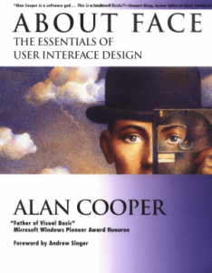
The first edition About Face, is the book that brought interaction design out of the research labs and into the everyday lexicon, and the updated Fourth Edition continues to lead the way with ideas and methods relevant to today’s design practitioners and developers.
I first read & bought a copy of the book in it’s 2nd edition while studying my Masters at UTS back in 2003, and also own the 3rd edition. It is a brilliant read and completely recommend it.
Opertoon and Creative Applications Network have written about a recently launched website, TimeFraming: The Art of Comics on Screen – dedicated to exploring what comics can teach about communicating creatively in the age of screen media.
We’re living in the age not just of screens, but of divided screens; boxes of time are all around us. We find them in split-screen sequences in movies and TV, multiplayer video games, videoconferencing, and more—wherever we turn, it seems, boxes of time have become a major part of the way we communicate visually. As it happens, one medium has long proven adept at choreographing boxes of time for storytelling purposes: comics.Erik Loyer
The site is an extension to a talk earlier this year by Erik Loyer titled, Space Into Game, Time Into Book: What Comics And Screens Do Together at City University of Hong Kong.
Below are links to chapters from the talk and a 20 min video version.
Image Source: Creative Applications Network
Time Magazine has published the 25 best inventions of 2014. My favourite is by far the Kickstarter funded Hendo hoverboard.
… the technology that powers it could be revolutionary. Using the $450,000-plus it raised on Kickstarter, Hendo founders Jill and Greg Henderson plan to develop magnetic “hovering” tech to stabilize buildings during earthquakes, protect valuable works of art and more.Time Magazine
The other innovations which made the list includes, The Supersmart Spacecraft by the Indian Space Research Organisation, Wireless electricity by Witricity Corp developed for use in cars, PCs, etc, the Blackphone to protect your mobile privacy and Lumo Lift, a magnetic lapel activity tracker which stops you from slouching.
Image Sources: Time Magazine
Technology review on how some cities are using Mobile apps, sensors, and other technologies to handle growing challenges.
Fifty-four percent of humanity lives in urban centers, and almost all of the world’s projected population growth over the next three decades will take place in cities, including many very poor cities. Because of their density and often strained infrastructure, cities have an outsize impact on the environment, consuming two-thirds of the globe’s energy and contributing a large share of its greenhouse-gas emissions. Urban water systems are leaky. Pollution levels are often extreme.Technology Review
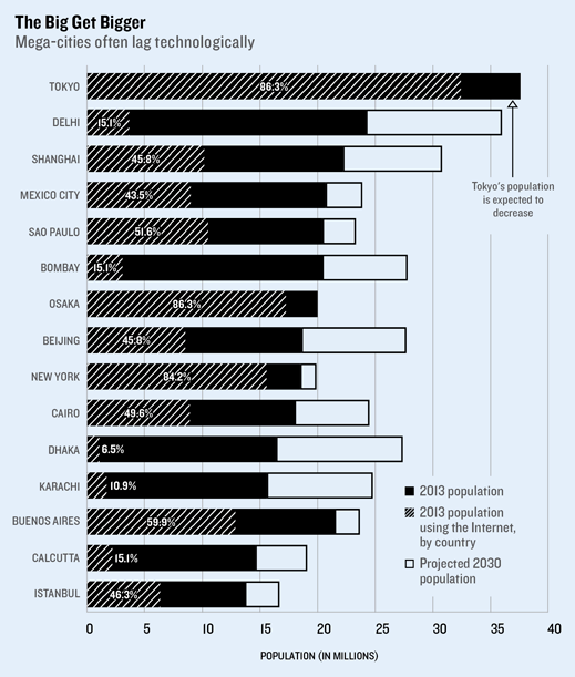
Image source: Technology Review
Photo Reference: Flickr
UX Matters have written a summary on some of the Principles of Great UX Design.
The article is a summary of a panel discussion written by Janet M. Six, covering Design Principles and and also how UX design takes place in organizations with designers of difference backgrounds.
—It’s often easy to think of a user journey like a storybook. If you open most books to any given page and select a word, you’ll be met with an abundance of context on the page. You’ll usually see the title of the book, the chapter, the page number, and the word will appear contextually within a sentence, paragraph, and page. Ensure that users are contextually aware of where they are within their journey.
—Be approachable, trustworthy, and transparent. Provide human interactions over machine-like interactions.
—Establish a strong information scent. Provide wayfinding signs.
—Reduce the user’s cognitive workload whenever possible. Be consistent and clear, and establish a strong visual hierarchy.
—Establish a strong signal-to-noise ratio. Avoid distractions, jargon, and long loading times.
The discussion also covered
Photo reference: John Maeda at TED on Simplicity
The Financial Times has created a micro-site which lists the best business books of the Decade across a number of areas including History, Economics, Behavioural Science, Technology, Innovation and others.
There goes my weekends. :)