A documentary of the Steven Levitt book, Freakonomics is due for release on October 1st in the US.
I really enjoyed reading it a few years ago, so let’s hope it lives up to the hype of the book.
A documentary of the Steven Levitt book, Freakonomics is due for release on October 1st in the US.
I really enjoyed reading it a few years ago, so let’s hope it lives up to the hype of the book.
A great paper from Joanne Mendel and Jan Yeager on Information
Visualisation (knowledge) as a design activity in problem solving.
This paper discusses the increasing complexity of problem solving in our
practice and the need for more robust tools or processes to design more
appropriate, applicable and meaningful products.
Via InfoDesign
A brilliant blog post by Mel Edwards on Service & Experience Maps.
What’s a customer experience map?
It’s a graphical representation of the service journey of a customer. It shows their perspective from the beginning, middle and end as they engage a service to achieve their goal, showing the range of tangible and quantitative interactions, triggers and touchpoints, as well as the intangible and qualitative motivations, frustrations and meanings.
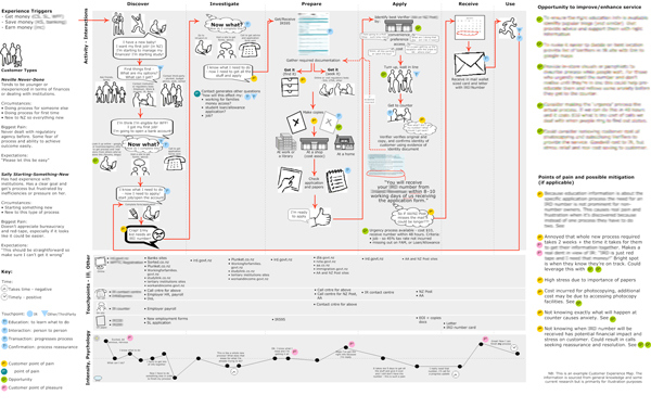
Similar to Service Design Maps, the customer experience maps which Mel discusses covers 6 dimensions & 3 components that help in considering what is recommended in the design.
6 Dimensions:
3 components:
A great UX Matters article of favourite User Experience & Technology blogs by fellow experts & writers.
The following experts contributed to the column:
Patternry, previously known as The UI Pattern Factory (and for a while Pattern App), is a resource for everyone who needs to design or develop user interfaces.
It is a collection of Web design patterns, best practices, which helps you to find inspiration and design interfaces with great user experience. It is also a user interface gallery full of real world examples of our patterns.
A really interesting Clay Shirky talk from Web 2.0 Expo NY.
His talk “It’s Not Information Overload. It’s Filter Failure” challenges the idea that we’ve got information overload problems (we’ve had more books than any human could read for hundreds of years), what we have is a series of filter failures, as our systems for managing information abundance are swamped by the growth of information.
See also:
Following Luke Wroblewski’s 2009 Parti & The Design Sandwich talk from Interaction09 in Vancouver, he has written a summary on how to go about developing Design Principles.
In order to be most effective, however, design principles need to provide teams with a way to gauge design decisions. That is, they should be specific enough to help groups of people choose between different design options.Unfortunately, many team’s first tendency when creating design principles is to go too broad. Principles like “make it easy to use”, “keep it fast”, or “put the user first” are usually some of the most common ideas that spring to mind.Luke Wroblewski
Update: Dave Malouf has recently referenced this talk What are and how I have come to use design principles in my practice
Ralph Lengler and Martin J Eppler have published an insightful table of Visualization Methods.
The Table is taken from the paper Towards A Periodic Table of Visualization Methods for Management
Lengler R., Eppler M. (2007). Towards A Periodic Table of Visualization Methods for Management. IASTED Proceedings of the Conference on Graphics and Visualization in Engineering (GVE 2007), Clearwater, Florida, USA.
An interview by UIE’s Ashley McKee with Carolyn Snyder, the author of the definitive 2003 book, Paper Prototyping.
It’s an interesting read and anyone new to paper prototyping will find it useful on areas of what the technique is, who can use it, and how it’s beneficial to the design process.
I do like the concept that you have with the information scent, the semantic mapping. I think it definitely ties into the mental model that a user has when they approach search and they are doing a query. They’re looking for things that come back to match what they have on their mind, what they are looking for in the results, so the more they actually see those search terms and things they are having in their mind, in terms of what they’re expecting to see, the more relevant the search is going to be for them.
Reference: An interview by Gord Hotchkiss of SearchEngineLand
Artists and designers are trained to use the language of explicit meanings to a rich communicative element over and above direct functional communication. If we only design with the function of something, not what it also communicates, we risk our designs being misinterpreted. Worst, we waste an opportunity to enhance everyday life.
I came across a really interesting blog post by Jensen Harris, on Fitt’s law and new Microsoft Office “Ribbon” user interface.
Fitts’ law is a model of human movement, predicting the time required to rapidly move from a starting position to a final target area, as a function of the distance to the target and the size of the target. Fitts’ law is used to model the act of pointing, both in the real world, for example, with a hand or finger and on computers, for example, with a mouse. It was published by Paul Fitts in 1954.
Reference: Wikipedia on Fitt’s Law
I’ve uploaded my powerpoint slides on the UK’s Digital Television Switchover from EuroIA in Berlin earlier this year onto Slideshare.
This years theme focused on ‘Building Our Practice’ and was a real privilege to attend and also speak this year.
The conference Keynote was by Peter Morville, president and founder of Semantic Studios, a leading information architecture, user experience, and findability consultancy. He is widely recognised as a father of the information architecture field, and he serves as a passionate advocate for the critical role that findability & information plays in defining the user experience.
Here are links to the 2006 Programme, Presenters & Speakers and Poster sessions
Etymology is the study of the origins of words. Through old texts and comparison with other languages, etymologists reconstruct the history of words – when they entered a language, from what source, and how their form and meaning changed.
Reference: Wikipedia’s definition of Etymology, viewed 10 September 2006.
A backronym or bacronym is a type of acronym that begins as an ordinary word, and is later interpreted as an acronym.
The word “backronym” is a portmanteau of back and acronym, and was coined in 1983. [1] The term is also used for a new set of words put to an existing acronym (e.g. “advanced research projects agency” → “arpa” → “address routing and parameters area”).
An acronym is a word created from the initial letters of a phrase: for example, Random Access Memory becomes RAM, pronounced as the word “ram”.
Reference: Wikipedia’s definition of Backronym, viewed 10 September 2006