I came across this brilliant Medium post title Design & Redesign in Data Visualisation which discusses the recent trend of the design critique in dataviz.
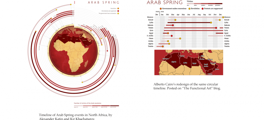
Last year, Alberto Cairo wrote about Visualisation Redesign on The Functional Art, and this essay goes more in-depth on the benefits.
I really love how a critique exposes a forced-push towards better design thinking and design.
Love it! :)
The example above is of the Arab Spring Data Visualisation by Alexander Katin / Kir Khanchaturov and the redesign by Alberto Cairo.

