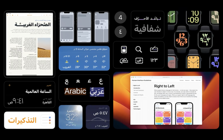
A really helpful WWDC 2022 video by Mohammed Samir (a Designer in the Apple Design team) on Designing for Arabic (in 2022).
The video covers a lot of already widely known UX/Design considerations, but goes into Cultural, Use & other important areas such as UI Directionality, Typography, Iconography & Numerals. There is around 660 million people that uses the Arabic script today, which makes it the third most written language in the world after Latin and Chinese.
Below are some important Principles from Apple’s Human Interface Guidelines on RTL (Right-to-Left) such as supporting languages like Arabic and Hebrew via reversing an interface as needed to match the reading direction of related content.
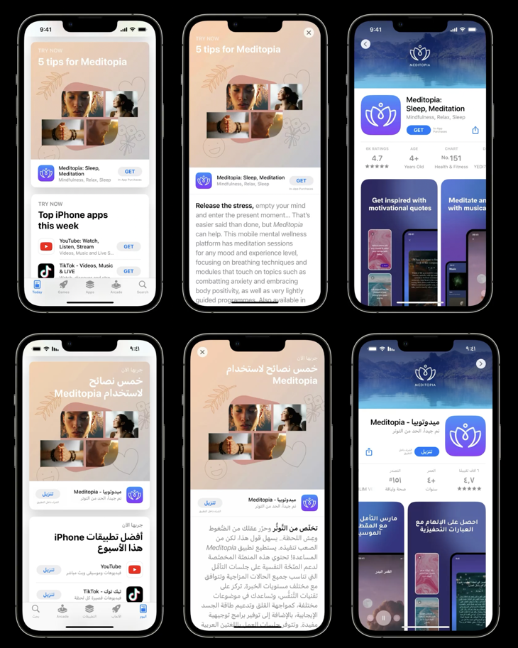
A basic Example Flow of accesing an App from within an App Store

RTL Principles
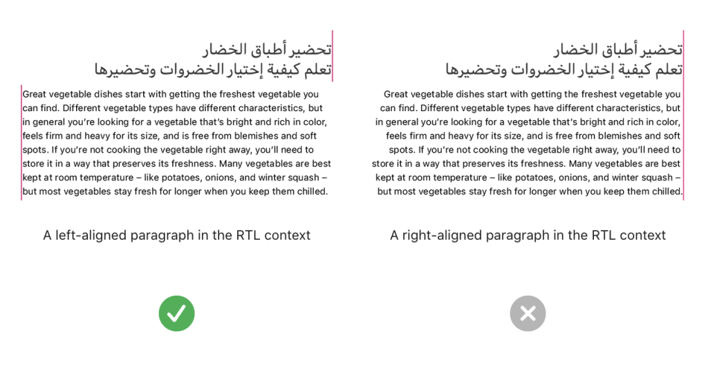
Align a paragraph based on its language, not on the current context. When the alignment of a paragraph — defined as three or more lines of text — doesn’t match its language, it can be difficult to read. For example, right-aligning a paragraph that consists of LTR text can make the beginning of each line difficult to see. To improve readability, continue aligning one- and two-line text blocks to match the reading direction of the current context, but align a paragraph to match its language.

Don’t reverse the order of numerals in a specific number. Regardless of the current language or the surrounding content, the digits in a specific number — such as “541,” a phone number, or a credit card number — always appear in the same order.
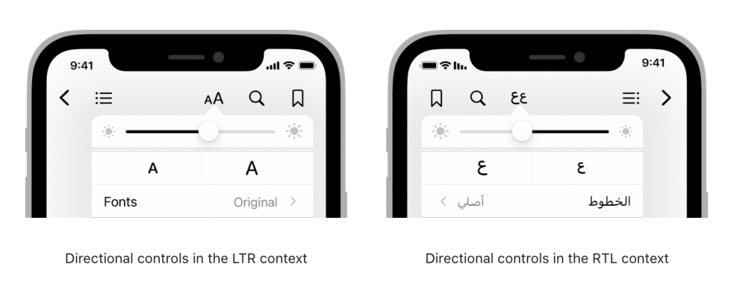
Flip controls that show progress from one value to another. Because people tend to view forward progress as moving in the same direction as the language they read, it makes sense to flip controls like sliders and progress indicators in the RTL context. When you do this, also be sure to reverse the positions of the accompanying glyphs or images that depict the beginning and ending values of the control.

Arabic version of the video – Design for Arabic · صمّم بالعربي

